Author: M Abo Bakar Aslam
Creating Simple Pages using HTML, External and Inline CSS
In this assignment, you will create FIVE different pages according to your selected project. Which pages should be created, this is your own choice.
When you are ready to submit this assignemnt, then click on below button.
You can follow below steps to create solution of the assignment.
Step 1; Selection of a Project
Select a project before start creating the assignment.
Step 2; Write project-name in below prompt and Give to ChatGPT
Write your project's name in below prompt. This is a detail prompt that you can give to ChatGPT, but first write your project name in this prompt.
I will have to create a web-based project titled as given below
[Project-name here]
I will have to create ten web pages.
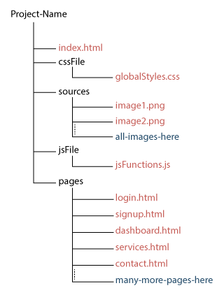
Folder structure for all pages and files should be as given below
Project-Name/
│
├── index.html
│
├── cssFile/
│ └── globalStyles.css
│
├── sources/
│ ├── image1.png
│ ├── image2.png
│ └── all-images-here/
│
├── jsFile/
│ └── jsFunctions.js
│
└── pages/
├── login.html
├── signup.html
├── dashboard.html
├── services.html
├── contact.html
├── navbar.html
└── many-more-pages-here/
Must follow below instruction to style html pages.
1. HTML pages should only be styled using external CSS. Inline CSS is not allowed. inline css is only allowed in case of min-width and max-width of the table and its th.
2. create structure for different component of HTML page such that minimum css's class can be used.
3. Don't create CSS classes (external css) more than 2. In other words, you can use maximum of two CSS classes per component.
Create CSS-file (used for external css) such that it will categorize different sections. This categorization will help to minimize css classes in HTML files.
I am given you a sample CSS-file sheet, in which this categorization is used. You are not restricted to use same categorization but you can improve it if you create better than.
Some detail is given in CSS-sheet
Use only flex system. don't use grid system.
Card should be center aligned horizontally
Tables should be set 100% width in external CSS. individual HTML file will set min-width and max-width using inline-css, according to their data.
In tables, two consecutive rows should have different colors. when hover over row, color should be changed.
navbar file should be created only once and other files should call the navbar file
media queries should also applied
below is detail sheet of CSS file (sample sheet).
Save css-sheet and folder structure in your memorize. I will ask more queries related to this record.
/* =========================================================
DESIGN SYSTEM
========================================================= */
:root {
--brand-primary-color: #color-hash-code;
--brand-secondary-color: #color-hash-code;
--brand-third-color: #color-hash-code;
--brand-fourth-color: #color-hash-code;
--brand-accent-color: #color-hash-code;
--bg-main: #color-hash-code;
--bg-card: #color-hash-code;
--text-primary-color: #color-hash-code;
--text-secondary-color: #color-hash-code;
--text-muted-color: #color-hash-code;
--text-focus-color: #color-hash-code;
--text-highlighted-color: #color-hash-code;
--border-primary-color: #color-hash-code;
--border-secondary-color: #color-hash-code;
--border-muted-color: #color-hash-code;
--border-focus-color: #color-hash-code;
--border-highlighted-color: #color-hash-code;
--radius-sm: 6px;
--radius-md: 10px;
--transition: 0.3s ease;
}
/* =========================================================
DARK MODE (OPTIONAL)
========================================================= */
[data-theme="dark"] {
--bg-main: #color-hash-code;
--bg-card: #color-hash-code;
--text-primary-color: #color-hash-code;
--text-secondary-color: #color-hash-code;
--text-muted-color: #color-hash-code;
--text-focus-color: #color-hash-code;
--text-highlighted-color: #color-hash-code;
--border-primary-color: #color-hash-code;
--border-secondary-color: #color-hash-code;
--border-muted-color: #color-hash-code;
--border-focus-color: #color-hash-code;
--border-highlighted-color: #color-hash-code;
}
/* =========================================================
GLOBAL BASE
========================================================= */
body {
margin: 0;
font-family: use-font-suitable-4-project-nature;
background: var(--bg-main);
color: var(--text-primary-color);
}
/* =========================================================
GLOBAL BUTTON SYSTEM
Thes properties will inherit in its sub-classes like link-button, nav-button etc
========================================================= */
button {
/* Create CSS styling here */
}
button:hover {
/* Create CSS styling here */
}
/* =========================================================
LINK BUTTON
========================================================= */
.link-button {
/* Create CSS styling here */
}
.link-button:hover {
/* Create CSS styling here */
}
/* =========================================================
Button Sizes
========================================================= */
button .lg-button{
/* Create CSS styling here */
}
button .sm-button{
/* Create CSS styling here */
}
button .tiny-button{
/* Create CSS styling here */
}
button .border-button{
/* Create CSS styling here */
}
/* =========================================================
SELECT input used in forms
========================================================= */
select {
/* Create CSS styling here */
}
/* Hover effect */
select:hover {
/* Create CSS styling here */
}
/* Focus effect */
select:focus {
/* Create CSS styling here */
}
/* Disabled state */
select:disabled {
/* Create CSS styling here */
}
.select-container {
/* Create CSS styling here */
}
/* =========================================================
NAV BUTTON
========================================================= */
nav button {
/* Create CSS styling here */
}
nav button:hover {
/* Create CSS styling here */
}
nav a{
/* Create CSS styling here */
}
nav a:hover{
/* Create CSS styling here */
}
h1 {
/* Create CSS styling here */
}
h2 {
/* Create CSS styling here */
}
h3{
/* Create CSS styling here */
}
h4{
/* Create CSS styling here */
}
p {
/* Create CSS styling here */
}
/* =========================================================
NAVBAR (RESPONSIVE + ROLE READY)
========================================================= */
nav {
/* Create CSS styling here */
}
/* Logo */
nav > a {
/* Create CSS styling here */
}
/* Menu list */
nav ul {
/* Create CSS styling here */
}
/* Links */
nav a {
/* Create CSS styling here */
}
nav a:hover {
/* Create CSS styling here */
}
/* Dropdown */
nav li {
/* Create CSS styling here */
}
nav .dropdown-menu {
/* Create CSS styling here */
}
nav .dropdown:hover .dropdown-menu {
/* Create CSS styling here */
}
nav .dropdown-menu a {
/* Create CSS styling here */
}
/* =========================================================
HAMBURGER BUTTON in navbar
========================================================= */
.menu-toggle {
/* Create CSS styling here */
}
/* =========================================================
MOBILE NAVBAR
========================================================= */
@media (max-width: 768px) {
.menu-toggle {
/* Create CSS styling here */
}
nav ul {
/* Create CSS styling here */
}
nav ul.open {
/* Create CSS styling here */
}
nav ul li {
/* Create CSS styling here */
}
nav ul li a {
/* Create CSS styling here */
}
/* Disable hover dropdown on mobile */
nav .dropdown:hover .dropdown-menu {
/* Create CSS styling here */
}
nav .dropdown-menu {
/* Create CSS styling here */
}
}
/* =========================================================
PAGE CONTENT
========================================================= */
.page {
/* Create CSS styling here */
}
/* =========================================================
CARD SYSTEM
========================================================= */
.card-container {
display: flex;
flex-wrap: wrap;
justify-content: center;
gap: 20px;
margin: 36px 12px;
/* more Create CSS styling here */
}
.card {
display: flex;
flex-direction: column;
/* Create CSS styling here */
}
.card:hover {
/* Create CSS styling here */
}
.card img {
width: 100%;
height: auto;
object-fit: contain;
border-radius: var(--radius-sm);
}
.card a {
background: none;
/* Create CSS styling here */
}
.card a:hover {
/* Create CSS styling here */
background: none;
}
/* =========================================================
FORM SYSTEM
========================================================= */
.form-container{
/* Create CSS styling here */
}
form div {
margin-bottom: 12px;
}
label {
/* Create CSS styling here */
}
input {
width: 100%;
/* Create CSS styling here */
}
input:focus {
/* Create CSS styling here */
}
form textarea {
width: 100%;
/* Create CSS styling here */
}
form textarea:focus {
/* Create CSS styling here */
}
/* =========================================================
TABLE SYSTEM
========================================================= */
.table-container {
width: 100%;
overflow-x: auto;
margin-top: 20px;
}
/* Base table */
table {
width: 100%;
border-collapse: collapse;
border-radius: var(--radius-md);
overflow: hidden;
/* Create CSS styling here */
}
/* Header */
table thead {
/* Create CSS styling here */
}
table th {
/* Create CSS styling here */
}
/* Body cells */
table td {
/* Create CSS styling here */
}
/* Row styles */
table tbody tr:nth-child(odd) {
/* Create CSS styling here */
}
table tbody tr:nth-child(even) {
/* Create CSS styling here */
}
table tbody tr:hover {
/* Create CSS styling here */
/* Last row border fix */
table tbody tr:last-child td {
/* Create CSS styling here */
}
/* Optional compact table */
.table-compact th,
.table-compact td {
/* Create CSS styling here */
}
/* Optional bordered table */
.table-bordered th,
.table-bordered td {
/* Create CSS styling here */
}
/* Optional striped stronger */
.table-striped tbody tr:nth-child(even) {
b/* Create CSS styling here */
}
/* Cell content handling */
td {
/* Create CSS styling here */
}
/* Empty state row */
.table-empty {
/* Create CSS styling here */
}
.table-row-selected {
/* Create CSS styling here */
}
/* =========================================================
FOOTER SYSTEM
========================================================= */
footer {
/* Create CSS styling here */
}
.footer-container {
/* Create CSS styling here */
}
.footer-container > div {
/* Create CSS styling here */
}
footer a {
/* Create CSS styling here */
}
footer a:hover {
/* Create CSS styling here */
}
footer p {
/* Create CSS styling here */
}
footer h1{
/* Create CSS styling here */
}
footer h2{
/* Create CSS styling here */
}
Step 3; Select FIVE pages
ChatGPT will give you ten pages. You can select any five pages.
Step 4; Folder Structure for the Project
Folder structure should be same as shown in below figure. Project main folder will contain multiple folders and files. Folders are representeed by black color and files are with red color.