Author: M Abo Bakar Aslam
Website Layouts
Website layout refers to how different elements and content are arranged on a web page to create a structured and visually appealing design. It plays a crucial role in user experience by organizing navigation, content, and interface components effectively. In this section, you will explore the key parts of a website layout, common layout patterns for different screen sizes, and the importance of designing mobile-first layouts for modern web development.
1. Key elements of a website layout
a. Header: The header typically contains a website logo, navigation menu, and important information like contact details or a search bar. It’s the top section of the page and serves as the main point of entry to the site’s content.
b. Navigation: The navigation menu is a crucial component that helps users find their way around the website. It includes links to various sections or pages of the site, facilitating easy access to content.
c. Content Area: This is where the main content of the web page is presented. It may include text, images, videos, and other types of media. The content area is where the website conveys its message or provides information.
d. Sidebar: Some websites feature sidebars on one or both sides of the content area. Sidebars can contain additional navigation links, widgets, advertisements, or other supplementary information.
e. Footer: The footer is located at the bottom of the web page and often includes copyright information, links to important pages (e.g., privacy policy, terms of service), and sometimes contact information.
2. Common Website Layouts
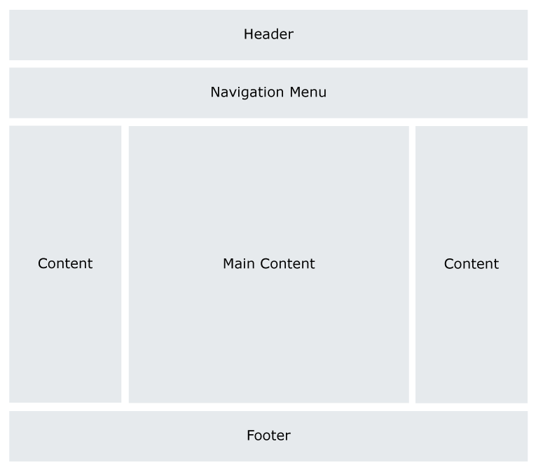
Example 1: Here is a common layout that is used by many websites.
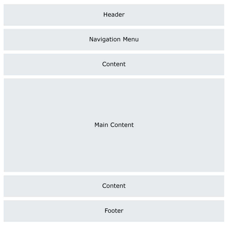
Example 2: Following layout is mostly used in mobile browser. This layout is called 1-column layout.

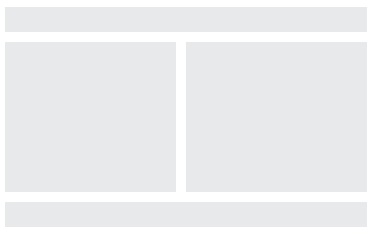
Example 3: Following layout is mostly used in tablet browser. This layout is called 2-column layout.
Example 4: Following layout is mostly used in larger screen window browser. This layout is called 3-column layout.

3. Suggestion
Always set layout for mobile devices, first. Set the layout for larger screen by using CSS.
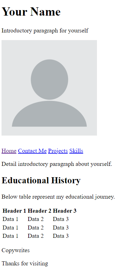
Example Layout-Code
It is one column layout that can be used for mobile devices.