Author: M Abo Bakar Aslam
Display as Flex
Flexbox is a powerful CSS layout system designed to arrange elements in a flexible and responsive way. It helps developers easily align, distribute, and control the size of items within a container, making modern web layouts more efficient and adaptive to different screen sizes. In this section, you will explore the core concepts of Flexbox and learn how to use its key properties to build responsive and well-structured layouts.
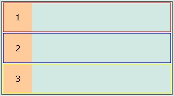
Example Code 1: Creating a simple container and nested container.
- All block elements are displaying in next line to each other. It means they are block elements (their border shows that).
- Images are used for explanation only. You can use any HTML element.
<!--File: myFile.html -->
<div style="border: 1px solid black;"><!--Outermost container-->
    <div style="margin: 2px; border: 1px solid red;"><!--nested containter 1-->
        <div style="width: 50px; height: 50px; background-color: #FFCB9A; display:flex; justify-content: center; align-items: center;">
            <div>1</div>
        </div>
    </div>
    <div style="margin: 2px; border: 1px solid blue;"><!--nested containter 2-->
        <div style="width: 50px; height: 50px; background-color: #FFCB9A; display:flex; justify-content: center; align-items: center;">
            <div>2</div>
        </div>
    </div>
    <div style="margin: 2px; border: 1px solid yellow;"><!--nested containter 3-->
        <div style="width: 50px; height: 50px; background-color: #FFCB9A; display:flex; justify-content: center; align-items: center;">
            <div>3</div>
        </div>
    </div>
</div>
Output
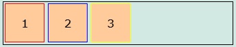
Example Code 2: Defining flex container
- Only set display value of outermost container as flex
- All nested container becomes inline-block elements (their border shows that)
    <!--File: myFile.html -->
<div style="border: 1px solid black; display: flex; "><!--Outermost container-->
    <div style="margin: 2px; border: 1px solid red;"><!--nested containter 1-->
        <div style="width: 50px; height: 50px; background-color: #FFCB9A; display:flex; justify-content: center; align-items: center;">
            <div>1</div>
        </div>
    </div>
    <div style="margin: 2px; border: 1px solid blue;"><!--nested containter 2-->
        <div style="width: 50px; height: 50px; background-color: #FFCB9A; display:flex; justify-content: center; align-items: center;">
            <div>2</div>
        </div>
    </div>
    <div style="margin: 2px; border: 1px solid yellow;"><!--nested containter 3-->
        <div style="width: 50px; height: 50px; background-color: #FFCB9A; display:flex; justify-content: center; align-items: center;">
            <div>3</div>
        </div>
    </div>
</div>
Output
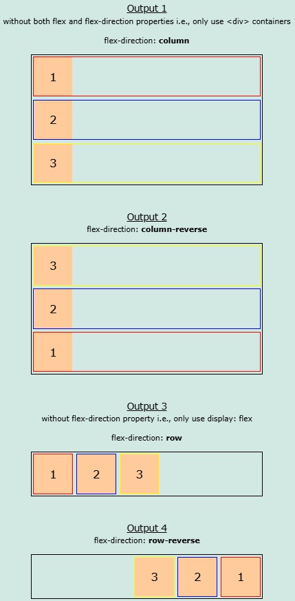
Example Code 3: Defining flex-direction along with flex display.
    <!--File: myFile.html -->
<div style="border: 1px solid black; display: flex; flex-direction: column; "><!--Outermost container-->
    <div style="margin: 2px; border: 1px solid red;"><!--nested containter 1-->
        <div style="width: 50px; height: 50px; background-color: #FFCB9A; display:flex; justify-content: center; align-items: center;">
            <div>1</div>
        </div>
    </div>
    <div style="margin: 2px; border: 1px solid blue;"><!--nested containter 2-->
        <div style="width: 50px; height: 50px; background-color: #FFCB9A; display:flex; justify-content: center; align-items: center;">
            <div>2</div>
        </div>
    </div>
    <div style="margin: 2px; border: 1px solid yellow;"><!--nested containter 3-->
        <div style="width: 50px; height: 50px; background-color: #FFCB9A; display:flex; justify-content: center; align-items: center;">
            <div>3</div>
        </div>
    </div>
</div>
Output
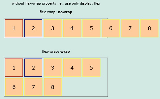
Example Code 4: Set value of flex-wrap as wrap
- Only set flex-wrap as wrap in outermost container
- Some container will be moved to next line, if space is less. While, if space is full,then all containers will be displayed in one line.
- If you didn't use wrap (use nowrap or remove flex-wrap), then flex-items will not be moved to next line, if space is less.
<!--File: myFile.html -->
<div style="border: 1px solid black; display: flex; flex-wrap: wrap; "><!--Outermost container-->
    <div style="margin: 2px; border: 1px solid red;"><!--nested containter 1-->
        <div style="width: 50px; height: 50px; background-color: #FFCB9A; display:flex; justify-content: center; align-items: center;">
            <div>1</div>
        </div>
    </div>
    <div style="margin: 2px; border: 1px solid blue;"><!--nested containter 2-->
        <div style="width: 50px; height: 50px; background-color: #FFCB9A; display:flex; justify-content: center; align-items: center;">
            <div>2</div>
        </div>
    </div>
    <div style="margin: 2px; border: 1px solid yellow;"><!--nested containter 3-->
        <div style="width: 50px; height: 50px; background-color: #FFCB9A; display:flex; justify-content: center; align-items: center;">
            <div>3</div>
        </div>
    </div>
    <div style="margin: 2px; border: 1px solid yellow;"><!--nested containter 4-->
        <div style="width: 50px; height: 50px; background-color: #FFCB9A; display:flex; justify-content: center; align-items: center;">
            <div>4</div>
        </div>
    </div>
    <div style="margin: 2px; border: 1px solid yellow;"><!--nested containter 5-->
        <div style="width: 50px; height: 50px; background-color: #FFCB9A; display:flex; justify-content: center; align-items: center;">
            <div>5</div>
        </div>
    </div>
    <div style="margin: 2px; border: 1px solid yellow;"><!--nested containter 6-->
        <div style="width: 50px; height: 50px; background-color: #FFCB9A; display:flex; justify-content: center; align-items: center;">
            <div>6</div>
        </div>
    </div>
    <div style="margin: 2px; border: 1px solid yellow;"><!--nested containter 7-->
        <div style="width: 50px; height: 50px; background-color: #FFCB9A; display:flex; justify-content: center; align-items: center;">
            <div>7</div>
        </div>
    </div>
    <div style="margin: 2px; border: 1px solid yellow;"><!--nested containter 8-->
        <div style="width: 50px; height: 50px; background-color: #FFCB9A; display:flex; justify-content: center; align-items: center;">
            <div>8</div>
        </div>
    </div>
</div>
Output
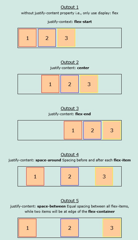
Example Code 5: justify-content
- Use justify-content along with flex propery
- Align flex-iterms horizontally
    <!--File: myFile.html -->
<div style="border: 1px solid black; display: flex; justify-content: center; "><!--Outermost container-->
    <div style="margin: 2px; border: 1px solid red;"><!--nested containter 1-->
        <div style="width: 50px; height: 50px; background-color: #FFCB9A; display:flex; justify-content: center; align-items: center;">
            <div>1</div>
        </div>
    </div>
    <div style="margin: 2px; border: 1px solid blue;"><!--nested containter 2-->
        <div style="width: 50px; height: 50px; background-color: #FFCB9A; display:flex; justify-content: center; align-items: center;">
            <div>2</div>
        </div>
    </div>
    <div style="margin: 2px; border: 1px solid yellow;"><!--nested containter 3-->
        <div style="width: 50px; height: 50px; background-color: #FFCB9A; display:flex; justify-content: center; align-items: center;">
            <div>3</div>
        </div>
    </div>
</div>
Output
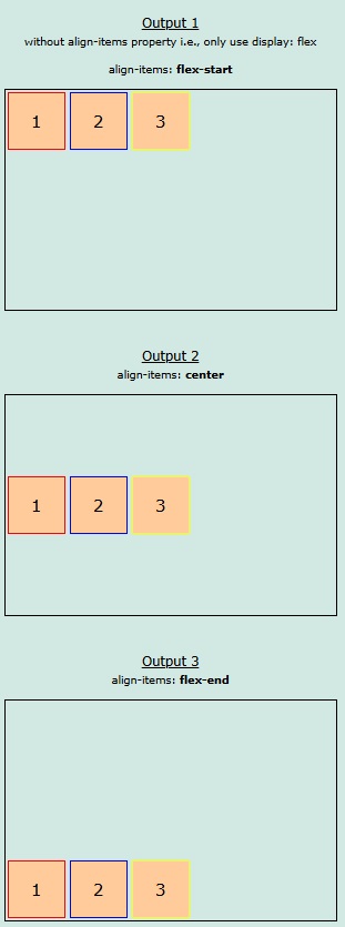
Example Code 6: align-items
- Use align-items along with flex propery
- Align flex-iterms vertically
- Height of outermost container is increased for better explanation.
    <!--File: myFile.html -->
<div style="border: 1px solid black; height: 200px; display: flex; align-items: flex-start; "><!--Outermost container-->
    <div style="margin: 2px; border: 1px solid red;"><!--nested containter 1-->
        <div style="width: 50px; height: 50px; background-color: #FFCB9A; display:flex; justify-content: center; align-items: center;">
            <div>1</div>
        </div>
    </div>
    <div style="margin: 2px; border: 1px solid blue;"><!--nested containter 2-->
        <div style="width: 50px; height: 50px; background-color: #FFCB9A; display:flex; justify-content: center; align-items: center;">
            <div>2</div>
        </div>
    </div>
    <div style="margin: 2px; border: 1px solid yellow;"><!--nested containter 3-->
        <div style="width: 50px; height: 50px; background-color: #FFCB9A; display:flex; justify-content: center; align-items: center;">
            <div>3</div>
        </div>
    </div>
</div>
Output
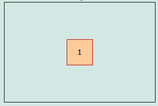
Example Code 7: Both align-items and justify-content
- Align both vertically and horizontally
- It is mostly used to align items as center in the screen or any container i.e., align center for both vertically and horizontally.
<!--File: myFile.html -->
<div style="border: 1px solid black; height: 200px; display: flex; justify-content: center; align-items: center; "><!--Outermost container-->
    <div style="margin: 2px; border: 1px solid red;"><!--nested containter 1-->
        <div style="width: 50px; height: 50px; background-color: #FFCB9A; display:flex; justify-content: center; align-items: center;">
            <div>1</div>
        </div>
    </div>
</div>
Output
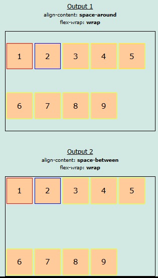
Example Code 8: align-content (Can be skipped. You can do its work by using justify-content and align-items together. Moreover, you will have to use multiple flex containers.)
- It is mostly used to align flex-items vertically either as space-around or space-between
- Align flex-items vertically
    <!--File: myFile.html -->
<div style="border: 1px solid black; height: 200px; display: flex; align-content: space-around; flex-wrap: wrap; "><!--Outermost container-->
    <div style="margin: 2px; border: 1px solid red;"><!--nested containter 1-->
        <div style="width: 50px; height: 50px; background-color: #FFCB9A; display:flex; justify-content: center; align-items: center;">
            <div>1</div>
        </div>
    </div>
    <div style="margin: 2px; border: 1px solid blue;"><!--nested containter 2-->
        <div style="width: 50px; height: 50px; background-color: #FFCB9A; display:flex; justify-content: center; align-items: center;">
            <div>2</div>
        </div>
    </div>
    <div style="margin: 2px; border: 1px solid yellow;"><!--nested containter 3-->
        <div style="width: 50px; height: 50px; background-color: #FFCB9A; display:flex; justify-content: center; align-items: center;">
            <div>3</div>
        </div>
    </div>
</div>
Output